Day Night Mode using only HTML & CSS
Hello readers, today in this blog I will create a Day-Night Mode On Card using only HTML & CSS. Earlier I have shared a How to Custom Radio Button using HTML & CSS now this I will build day-night mode.
In simple language, day mode means bright color like white color and night means dark color like black color. The main motive of day-night mode is to make user eyes healthier while they are using mobile or computer.
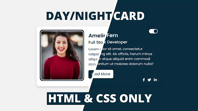
As you can see on the given image which is given on the webpage. This is the real image that I’m going to build in this program [Day Night Mode on Card], the left part of the image is “Day Mode” and the right part is the “Night Mode”. Basically, at first, there is only one profile card in day mode condition, when we clicked the toggle this image transform into night mode. As you can see that toggle is placed on the top right side of the image.
Day-Night Mode [Source Code]
To create this Number Guessing Game, follow the given steps line by line:
1. Create a folder. You can name this folder whatever you want, and inside this folder, create the mentioned files.
2. Create an index.html file. The file name must be index and its extension .html
3. Create a style.css file. The file name must be style and its extension .css
4. Create a script.js file. The file name must be script and its extension .js
First, paste the following codes into your index.html file.
<!-- Designined by CodingLab | www.youtube.com/codinglabyt -->
<html lang="en" dir="ltr">
<title> Day Night Toggle | CodingLab </title>
<link rel="stylesheet" href="style.css">
<link rel="stylesheet" href="https://cdnjs.cloudflare.com/ajax/libs/font-awesome/5.15.2/css/all.min.css"/>
<meta name="viewport" content="width=device-width, initial-scale=1.0">
<input type="checkbox" id="switch">
<span class="circle"></span>
<img src="img-1.jpg" alt="">
<div class="name">Amelia Fern</div>
<div class="job">Full Stack Developer</div>
<p>Lorem dolor sit amet, consectetur adipisicing elit. Ab officiis, harum minus aliquam atque aliquid enim commodi accusantium ut maiores dolorum nulla?</p>
<button>Read More</button>
<div class="media-icons">
<i class="fab fa-facebook-f"></i>
<i class="fab fa-twitter"></i>
<i class="fab fa-linkedin-in"></i>
<!DOCTYPE html>
<!-- Designined by CodingLab | www.youtube.com/codinglabyt -->
<html lang="en" dir="ltr">
<head>
<meta charset="UTF-8">
<title> Day Night Toggle | CodingLab </title>
<link rel="stylesheet" href="style.css">
<link rel="stylesheet" href="https://cdnjs.cloudflare.com/ajax/libs/font-awesome/5.15.2/css/all.min.css"/>
<meta name="viewport" content="width=device-width, initial-scale=1.0">
</head>
<body>
<div class="container">
<input type="checkbox" id="switch">
<div class="outer">
<div class="content">
<label for="switch">
<span class="toggle">
<span class="circle"></span>
</span>
</label>
<div class="image-box">
<img src="img-1.jpg" alt="">
</div>
<div class="details">
<div class="name">Amelia Fern</div>
<div class="job">Full Stack Developer</div>
<div class="buttons">
<p>Lorem dolor sit amet, consectetur adipisicing elit. Ab officiis, harum minus aliquam atque aliquid enim commodi accusantium ut maiores dolorum nulla?</p>
<button>Read More</button>
</div>
</div>
<div class="media-icons">
<i class="fab fa-facebook-f"></i>
<i class="fab fa-twitter"></i>
<i class="fab fa-linkedin-in"></i>
</div>
</div>
</div>
</div>
</body>
</html>
Second, paste the following codes into your style.css file
@import url('https://fonts.googleapis.com/css2?family=Poppins:wght@200;300;400;500;600;700&display=swap');
font-family: 'Poppins',sans-serif;
#switch:checked ~ .outer{
box-shadow: 0 5px 10px rgba(0, 0, 0, 0.15);
#switch:checked ~ .outer .content{
box-shadow: 0 5px 10px rgba(0, 0, 0, 0.5);
#switch:checked ~ .outer .toggle{
transition: all 0.3s ease;
#switch:checked ~ .outer .circle{
#switch:checked ~ .outer .image-box{
box-shadow: 0 5px 10px rgba(0, 0, 0, 0.15);
#switch:checked ~ .outer .image-box img{
border-color: transparent;
margin: 10px 0 20px 20px;
#switch:checked ~ .outer .details{
transition: all 0.3s ease;
#switch:checked ~ .outer button{
justify-content: flex-end;
#switch:checked ~ .outer i{
@import url('https://fonts.googleapis.com/css2?family=Poppins:wght@200;300;400;500;600;700&display=swap');
*{
margin: 0;
padding: 0;
box-sizing: border-box;
font-family: 'Poppins',sans-serif;
}
.outer{
height: 100vh;
width: 100%;
display: flex;
justify-content: center;
align-items: center;
background: #f2f2f2;
}
#switch:checked ~ .outer{
background: #092c3e;
}
.content{
display: flex;
width: 570px;
padding: 15px;
background: #fff;
border-radius: 12px;
position: relative;
box-shadow: 0 5px 10px rgba(0, 0, 0, 0.15);
}
#switch:checked ~ .outer .content{
background: #092c3e;
box-shadow: 0 5px 10px rgba(0, 0, 0, 0.5);
}
.outer .toggle{
position: absolute;
width: 40px;
height: 20px;
border-radius: 20px;
background: #092c3e;
right: 15px;
top: 13px;
display: flex;
align-items: center;
cursor: pointer;
}
#switch:checked ~ .outer .toggle{
background: #fff;
}
.outer .toggle .circle{
margin-left: 3px;
height: 16px;
width: 16px;
border-radius: 50%;
background: #fff;
transition: all 0.3s ease;
}
#switch:checked ~ .outer .circle{
margin-left: 22px;
background: #092c3e;
}
.image-box {
height: 232px;
width: 200px;
border-radius: 12px;
padding: 3px;
background: #092c3e;
}
.image-box img {
height: 100%;
width: 100%;
object-fit: cover;
border: 3px solid #fff;
border-radius: 12px;
}
#switch:checked ~ .outer .image-box{
box-shadow: 0 5px 10px rgba(0, 0, 0, 0.15);
}
#switch:checked ~ .outer .image-box img{
border-color: transparent;
}
.content .details{
width: 58%;
margin: 10px 0 20px 20px;
color: #092c3e;
}
#switch:checked ~ .outer .details{
transition: 0.1s;
color: #fff;
}
.content .details .name{
font-size: 23px;
font-weight: 600;
}
.content .details .job{
font-size: 18px;
font-weight: 500;
}
.content .details p{
font-size: 15px;
margin-top: 6px;
}
.content button{
display: block;
margin-top: 16px;
outline: none;
border: none;
font-size: 17px;
padding: 6px 14px;
border-radius: 6px;
color: #fff;
cursor: pointer;
background: #092c3e;
transition: all 0.3s ease;
}
.content button:hover{
transform: scale(0.97);
}
#switch:checked ~ .outer button{
background: #fff;
color: #092c3e;
}
.media-icons{
position: absolute;
bottom: 16px;
right: 15px;
margin-top: 12px;
justify-content: flex-end;
}
.media-icons i{
display: inline-flex;
margin: 0 4px;
font-size: 16px;
color: #092c3e;
opacity: 0.7;
cursor: pointer;
}
.media-icons i:hover{
opacity: 1;
}
#switch:checked ~ .outer i{
color: #fff;
opacity: 1;
}
#switch{
display: none;
}
If you face any difficulties while creating your Profile Card with Day Night Mode or your code is not working as expected, you can download the source code files for this Profile Car with Dark Light Mode for free by clicking on the download button, and you can also view a live demo of this card slider by clicking on the view live button.